Colour Mixing Essentials: A Practical Guide for Painting and Illustration
Colour Mixing Essentials: A Practical Guide for Painting and Illustration
Colour mixing is an exercise in control and restraint. Successful color work depends on a few clear habits: selecting a useful palette, attending to value and temperature, and making clean neutrals rather than relying on accidental mixtures. The guidance here emphasizes practical choices that can be applied across media.
Choose a limited starter palette
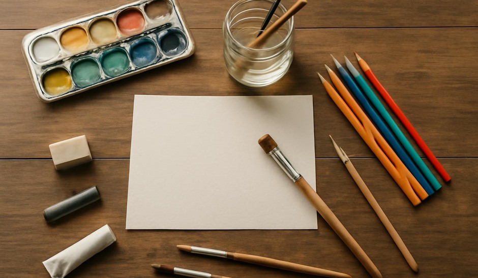
Limiting your palette reduces complexity and helps you learn relationships among pigments. A common three-color starter is a warm red, a cool blue, and a warm or cool yellow. From those you can mix a broad range of hues, manage chroma, and practice transparency and layering.
Understand value first
Before worrying about hue, consider value. Mix greys and neutrals to practice relative lightness and darkness. If you can match value correctly, hue adjustments are simpler. Use a small value scale as a reference to judge mixtures against highlights and shadows in your subject.
Control temperature deliberately
Temperature—warm versus cool—plays a major role in perceived depth and atmosphere. To keep mixes clear, decide whether to bias a mixture warm or cool. Warm mixtures tend to come forward in a composition; cool mixtures recede. Use that tendency intentionally for spatial clarity rather than as an afterthought.
Mix clean neutrals
Accidental browns and muddy greys often result from mixing complements at full strength. To create controlled neutrals, mix muted complements in small proportions or add a little grey made from white and black pigments. Practice mixing desaturated colours deliberately to maintain luminosity in shadow areas.
Use glazing and layering
Rather than trying to achieve every nuance in a single mixture, consider glazing or thin layers of color to build depth. Transparent pigments layered over neutral underpainting can achieve richness without muddiness. This is especially effective in watercolour and thin oil glazing techniques.
Test mixes in small swatches
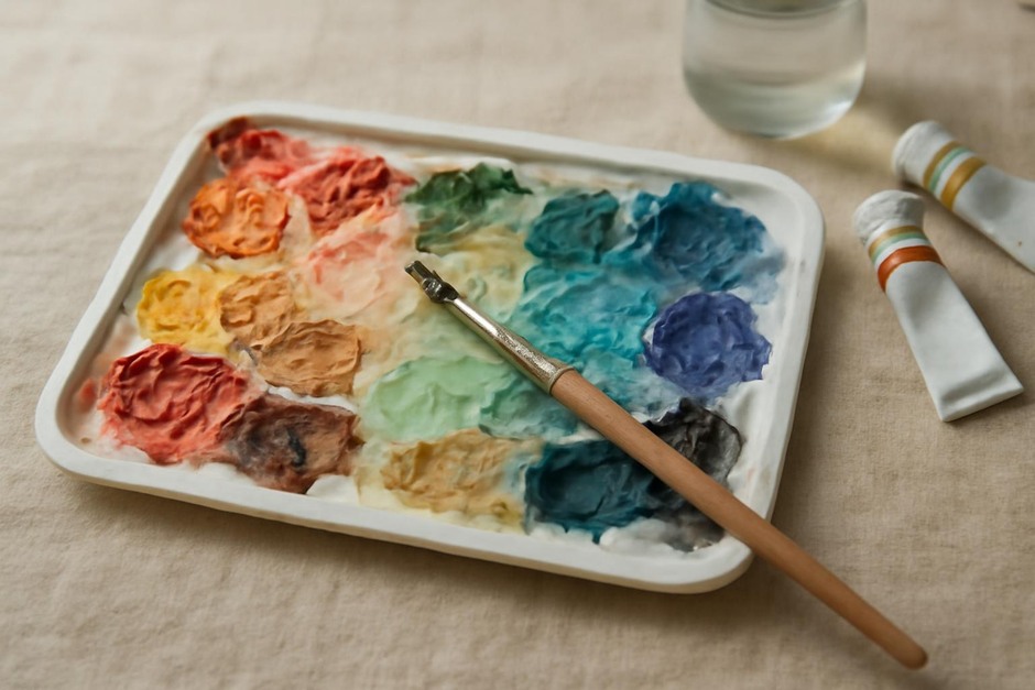
Before applying a color to a composition, make a small swatch or note a mixture recipe on a strip of paper. Record proportions or dominant pigments. This habit preserves useful mixtures and reduces the need to recreate a match under time pressure.
Consider substrate and drying changes
Colours can shift when they dry or sit on different grounds. Watercolour often dries lighter, and some oils yellow slightly on certain grounds. Test mixes on the actual support to see end behaviour and adjust mixtures accordingly.
Practice controlled experiments
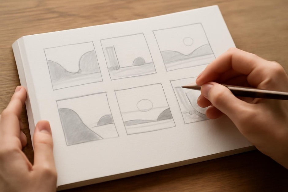
Set aside short studies to explore single relationships: a study of greens mixed from one yellow and one blue, or a greyscale exercise using pigments mixed to neutral. Repeated experiments build a practical memory of which pigments yield which results and under what conditions.
Colour mixing is a patient craft. By limiting choices, keeping value at the center of decisions, and developing habits like swatching and recorded recipes, you can achieve cleaner, more deliberate colour in painting and illustration. Over time, these practices turn technical skill into fluid, expressive control.